
So you’ve got your workforce analytics and/or workforce planning practice going. Well done! Now it’s time to start answering those questions your business stakeholders are asking, and driving real strategic value. Now, stop. Say the word “relevance”. Now repeat it ten times. This is going to be one of the major keys to the success of your internal analytics “product”.
By no coincidence, these are also my company’s four core values. However, for this blog series, I’ll be relating them to the practitioner side. I’ll also be looking back at past projects and how each core value came into play, both in not-so-successful and very successful ventures.

Relevance
See the first post in this series – “Accuracy” – here.
As you start to deliver internal workforce analytics products to your stakeholders, it’s extremely important to keep the concept of relevance top of mind. Sure, you could be showing them graphs and charts and information that they’ve never seen. But if you’re not directly answering the questions that they’re asking, you’re not providing the the value that you could be with a strong practice. When you see a graph, chart, table, or infographic, always ask yourself the question: does this have direct relevance to the question we’re trying to answer for? Does this tell us anything?
For our two examples below, we’re going to use a theoretical situation where the executives have expressed serious concern for potential risk to the business because of aging demographics. We’ll walk through two examples of this.
A “not so great” example:
Take a look at the dashboard below. This is very similar to a lot of traditional analytics and reporting that I’ve seen done.
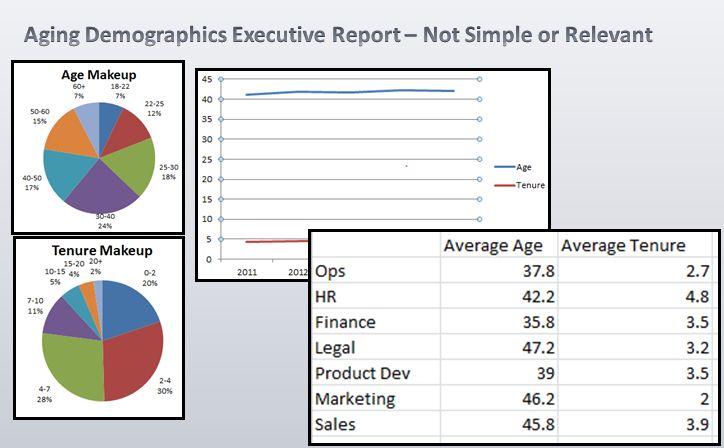
Workforce Analytics – Aging Demographics Example
Now, I’m by no means saying that this is not new or important information. It’s likely that before HR built an analytics practice, nobody could tell you the average age or tenure by group, or what the historical trend looks like. The problem here is that the charts create more questions than answers. Age has trended up a bit – but where? Sales has a high average age, but is it a significant problem, or is it a few long-time salespeople in their 70s that are skewing the average high. We get some directional information, but we still don’t know where we really have a problem.
This information, while “cool”, is not relevant to the question your business is asking – “where is the material risk?”.
A better example:
Keeping the question we’re answering in mind, take a look at a different approach below.
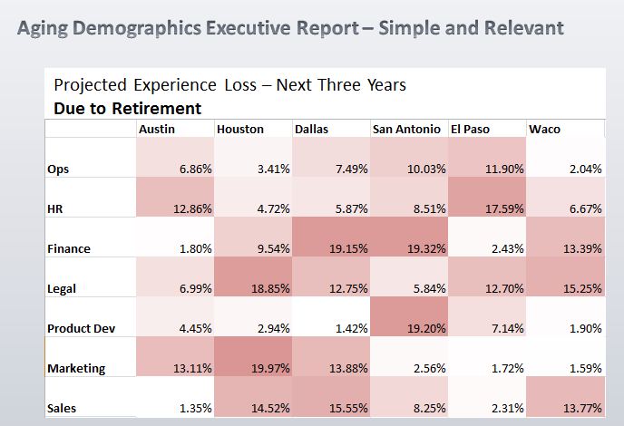
Workforce Analytics – Aging Demographics – Better Example
NOW we’re beginning to attack the issue that our executives are asking us to look at. We’ve managed to narrow it down from four or more charts into one heat map. We’re showing the executives:
– Exactly where the risk is
– In each function/location area, how severe the risk is
Your CEO is unlikely to care about average age and tenure. But they will care about this. We can see that we will lose close to 20% of Marketing in Houston. We can see that three sales groups (Waco, Dallas, Houston) are going to lose over 13% of their experience over the next three years. These are calls to action. Now we can dive further into the identified problem areas and begin to create solutions.
This is what a good internal workforce analytics product looks like. It’s simple, concise, and it answers the question. Of course in the real world, you would want your report to be more robust than this thought exercise. You’d want to look at by job, by critical job groupings, even down to individual employees and operational/financial impact. But you can see the clear distinction between the first and the second reports.
Don’t Bury The Lead.
Ultimately, you may want your reporting to include some more general metrics such as average age, as we see in the first example report. That may be fine. But always put the important part first. In this case, we’d lead with the heatmap to a) show the severity of the problem and b) capture our audience’s attention. A good report should be like a well written blog post or an article. It should grab attention immediately, have ebb and flow, and lead the audience where you want to go.
Always keep relevance in mind when you’re designing your analytics practice. Your business leaders will thank you for it. Further, your team will benefit from getting buy-in and support from your business leaders as you show immediate value.
Check back in with the Novel Intelligence blog for post #3 in this series: Flexibility.
Want help with your analytics project? Novel Intelligence can design and/or deliver reporting to your organization at a fraction of the price of software or traditional consulting. Let us help you get on your way!
Click here for a free consultation!