
Those of us who use Twitter are probably very familiar with the “trending now” feature. It’s prominently featured on your home page in prime web page real estate. It shows which topics are “hot” and trending upwards amongst the millions of Twitter conversations happening every day. What’s new? What’s cool today? What do people care about?
Neat feature, but you might be wondering how Twitter has anything to do with workforce planning or HR analytics. It’s because when presenting HR data, leveraging trends can often be more effective and relevant than the more traditional ways to present data related to your workforce.
Let’s start there. The traditional method I’m talking about is our old friend and mainstay, the pie chart. I’ve seen hundreds, maybe thousands of dashboards and reports people have built, and I’d wager that the pie chart is the most prominent way of displaying current or recent data. I’m certainly not saying that it doesn’t have usefulness in some areas. But I am suggesting that in some cases, there are better, more modern, and most importantly, more actionable ways to present the same data.
Let’s take a look at a “staple” of workforce analytics. The turnover reasons pie chart.
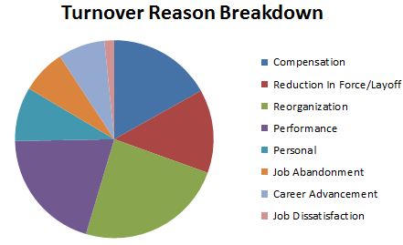
Turnover Reasons Pie Chart
This is a classic example of the pie chart doing its “job”, which is to present a simple, visual indication of which turnover reasons happen the most frequently. It does just that. We quickly see that re-orgs, performance, RIF, and compensation are our most common reasons for turnover. And job dissatisfaction is very low.
But here’s why the pie chart falls short: it creates more questions than answers. What does all of this mean? Is it healthy? Having a lot of performance-based turnover could go either way. It could mean you’re doing a good job of cycling low performers out. Or it could mean that overall organizational performance has decreased. What about the high number of leavers due to compensation? Is that unhealthy? Or is it acceptable/normal for your industry and location?
There’s nothing actionable here. In this particular instance, the pie chart is not giving us very valuable information. Sometimes it does. But not here.
Here’s where we can learn from Twitter.
By slightly shifting what data we present and how we present it, we can provide a much more powerful view on turnover reasons. Below is an example of a way to present trends in a slightly different way:
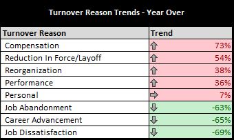
Turnover Reasons – Trend
Instead of the pie chart, we’re showing a one-year change in turnover reasons. We’ve changed from a pie chart to a trend table, but this isn’t the important part. The important part is changing the data we’re presenting. Instead of a static one-year view, we’ve changed to a dynamic multi-year trend view. This same info could be presented in a bar chart, infographic, or in several other ways.
What’s important is that there are calls to action here:
- We immediately see that our turnover due to job dissatisfaction has gone down tremendously. Perhaps we’ve put in some engagement programs that are working. We can now look into investing even more into these programs to continue our upward trend of retention and engagement.
- Also striking is the turnover due to compensation. It almost doubled in the past year. This tell us that it’s very likely that we are falling behind our competitors in the market. This provides impetus and data-driven justification to look into our compensation, perhaps pull some market data, and create outcomes based on the information.
This is a quick and dirty example, but you can see how leveraging trends vs. static point-in-time data can significantly increase the ability to create action from your workforce analytics efforts. I’m not saying to always use trends or to never use pie charts. It’s just another arrow in your quiver as you build towards a world-class workforce analytics and planning practice. As always, presenting metrics requires thoughtfulness and to always ask yourself “what purpose does this metric serve”. But using trending can be a very powerful and actionable way to present your data.
Onward!