
Those of us who use Twitter are probably very familiar with the “trending now” feature. It’s prominently featured on your home page in prime web page real estate. It shows which topics are “hot” and trending upwards amongst the millions of Twitter conversations happening every day. What’s new? What’s cool today? What do people care about?
Neat feature, but you might be wondering how Twitter has anything to do with workforce planning or HR analytics. It’s because when presenting HR data, leveraging trends can often be more effective and relevant than the more traditional ways to present data related to your workforce.
Let’s start there. The traditional method I’m talking about is our old friend and mainstay, the pie chart. I’ve seen hundreds, maybe thousands of dashboards and reports people have built, and I’d wager that the pie chart is the most prominent way of displaying current or recent data. I’m certainly not saying that it doesn’t have usefulness in some areas. But I am suggesting that in some cases, there are better, more modern, and most importantly, more actionable ways to present the same data.
Let’s take a look at a “staple” of workforce analytics. The turnover reasons pie chart.
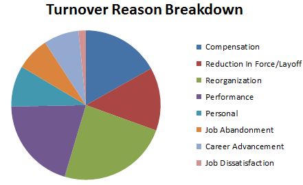
Turnover Reasons Pie Chart